Components
- #Storybook
- #Css Modules
- #NPM
- #Testing
- #Vite
- #React
- #Eslint
Description
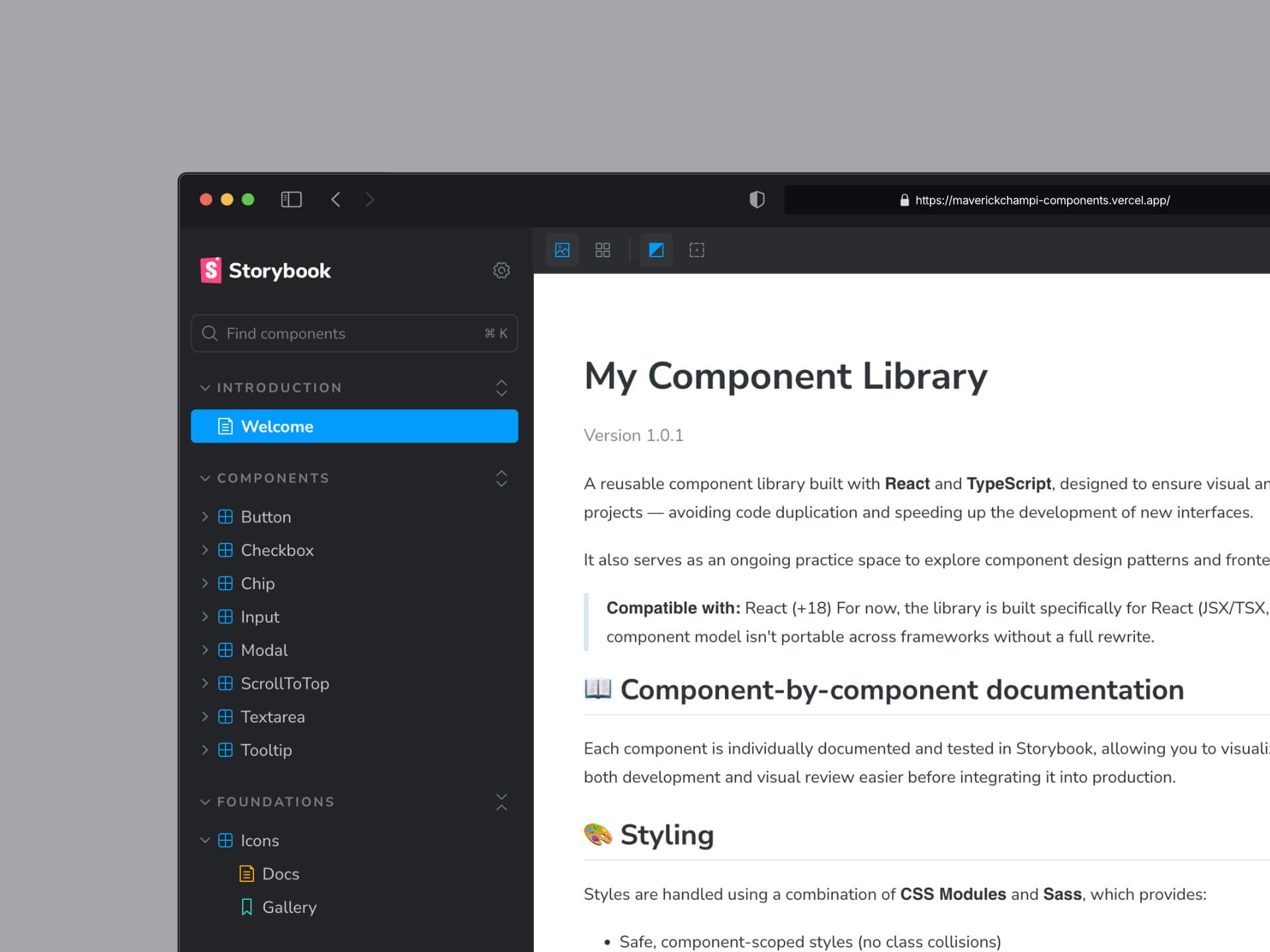
I developed this library of reusable components built with React and TypeScript, packaged and distributed via npm. The main goal of the project is to ensure visual and functional consistency across my various personal and professional projects, avoiding code duplication and speeding up the development of new interfaces. Additionally, it serves as a space for ongoing practice to explore component design patterns and best practices in front-end architecture.
Each component is individually documented and tested using Storybook, which allows you to view its different states, variants, and props in isolation, facilitating both development and visual review before integrating them into production. In terms of styling, we use a combination of CSS Modules and Sass, which provides a safe, component-specific scope for styles along with the power of variables, mixins, and nesting.
One of the key features of the library is its theming system using customizable Sass variables, which allows you to easily adjust the color palette and overall visual style to suit the needs of each project. This makes the library a flexible and scalable foundation, ready to adapt to different brand identities while maintaining consistency in structure and behavior.
Visit website See repository See npm